Free worldwide shipping on orders over $88.
Woven Label Design Mistakes to Avoid (And How to Get Them Right)
Let’s be honest — we’ve all seen clothing labels that just don’t look right. Maybe the text’s too small, the logo looks fuzzy, or the fold doesn’t sit flat.
If you’re investing time and money into custom woven labels, you want them to look professional and represent your brand perfectly.
Here’s a list of the most common woven label mistakes we see — and how to avoid them like a pro.
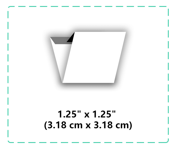
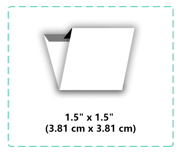
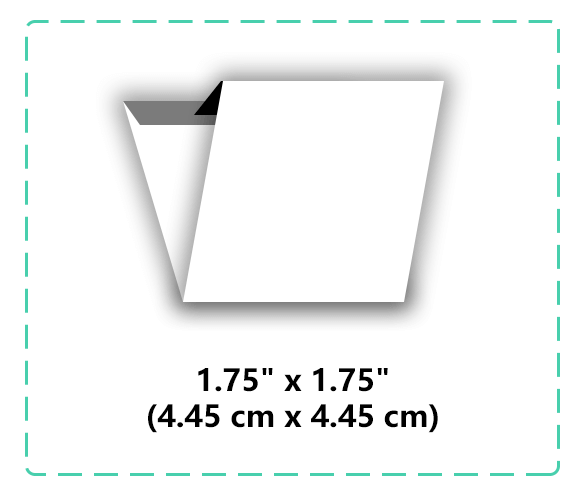
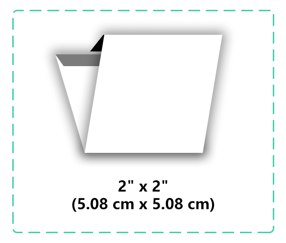
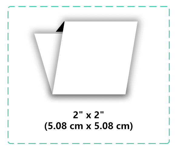
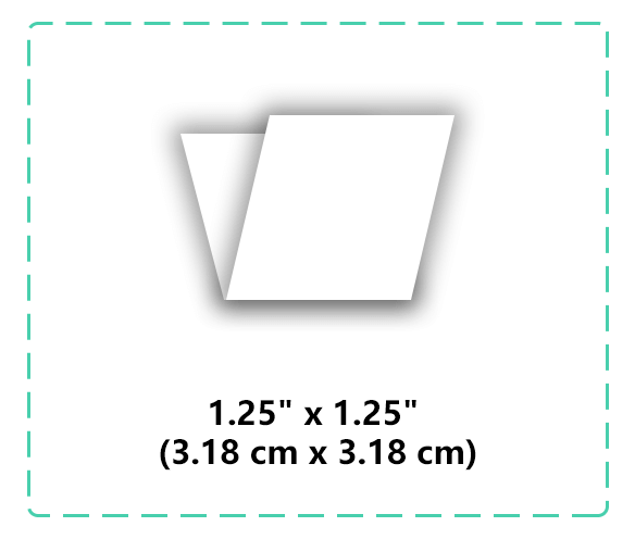
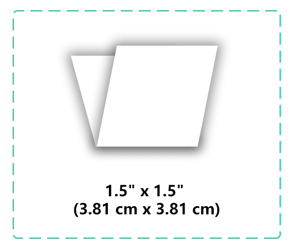
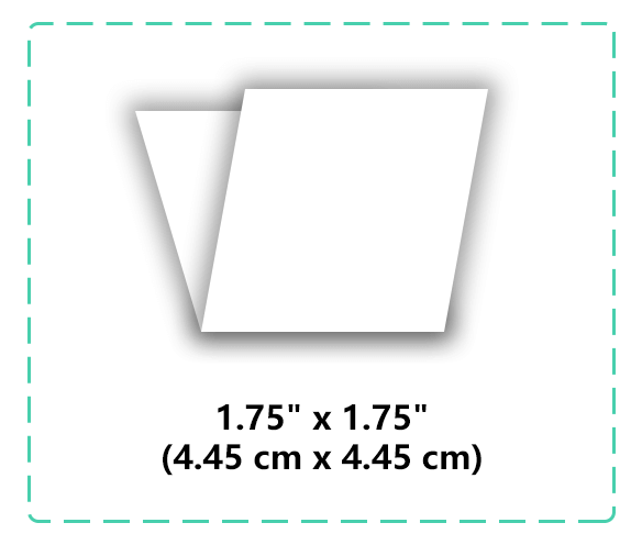
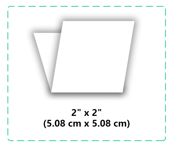
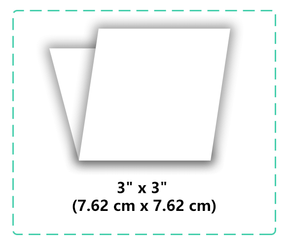
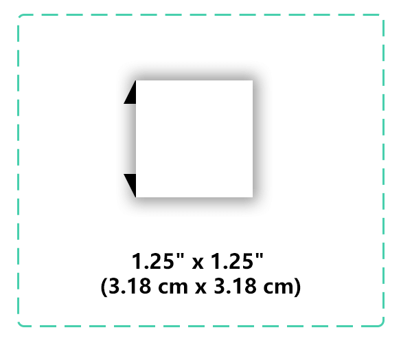
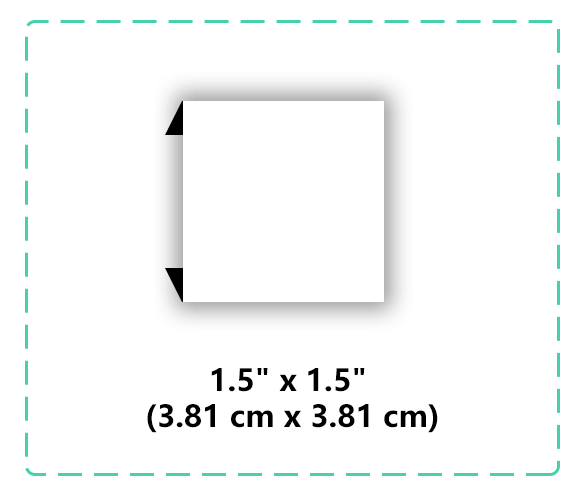
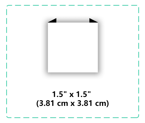
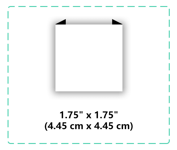
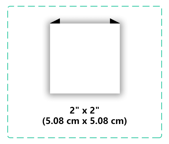
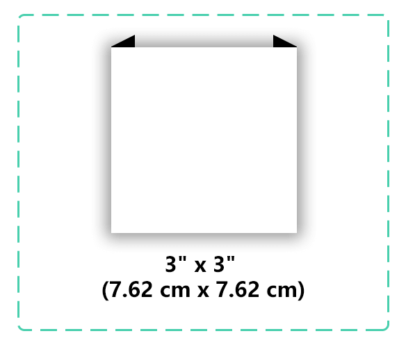
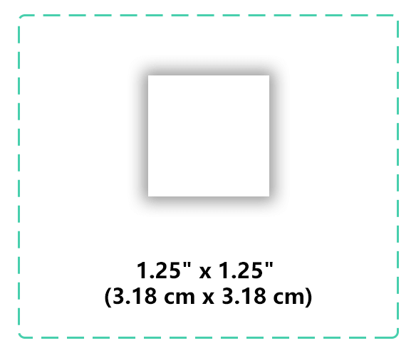
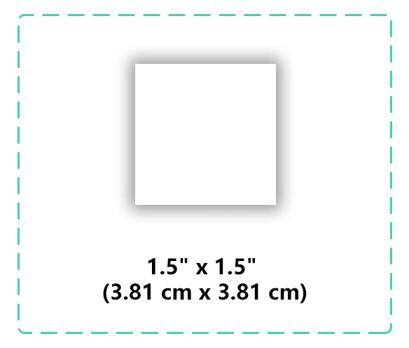
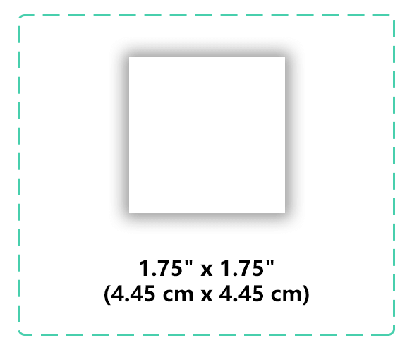
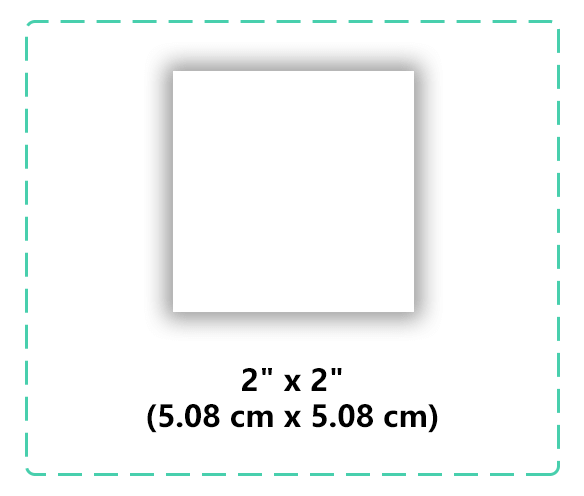
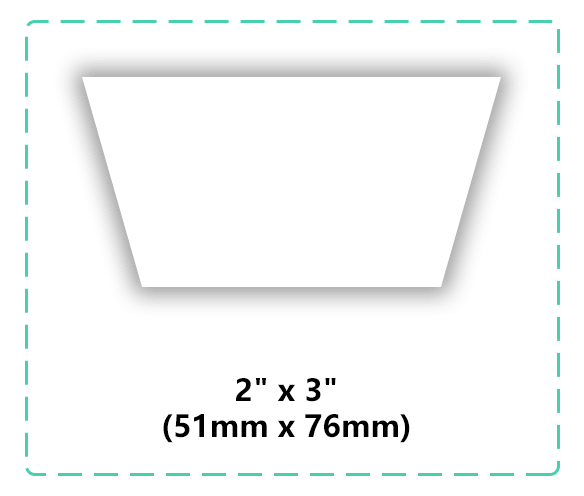
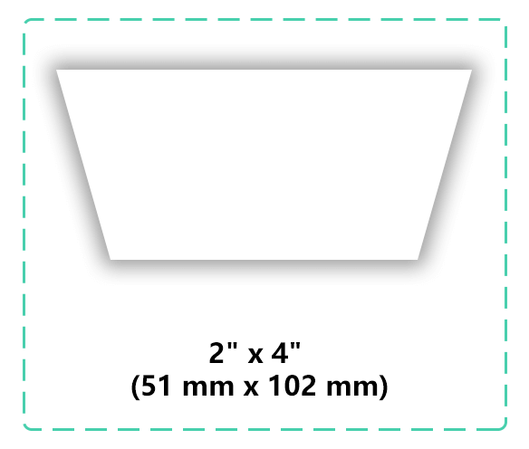
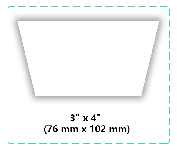
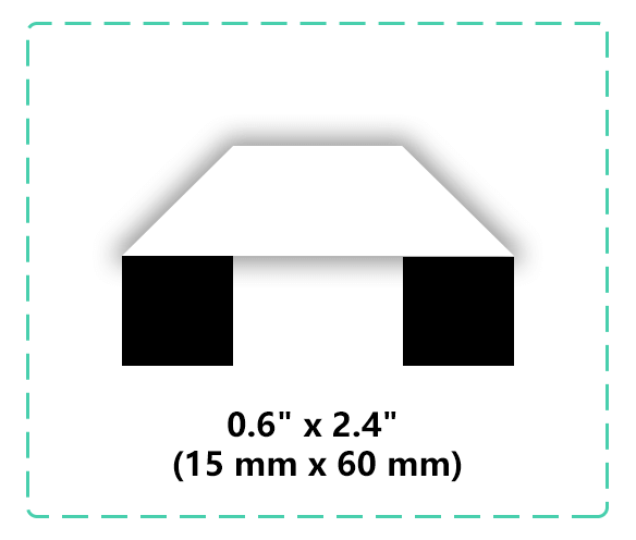
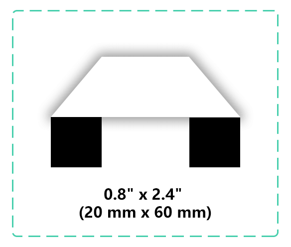
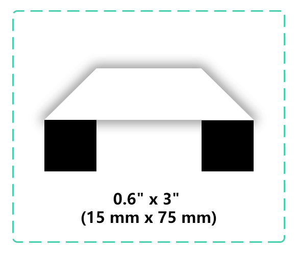
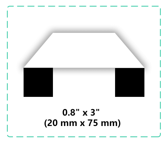
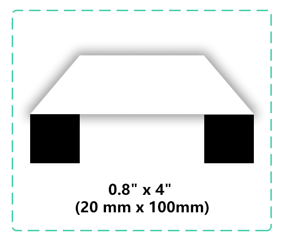
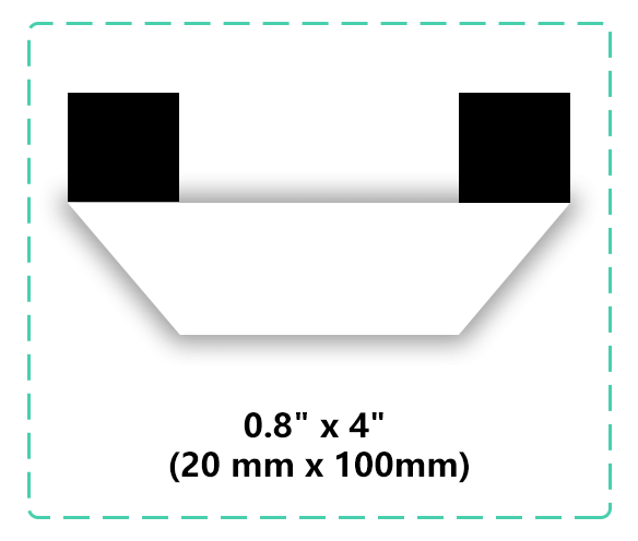
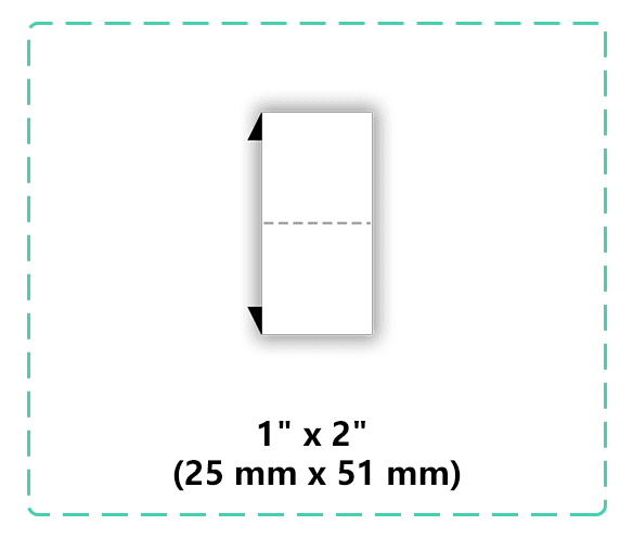
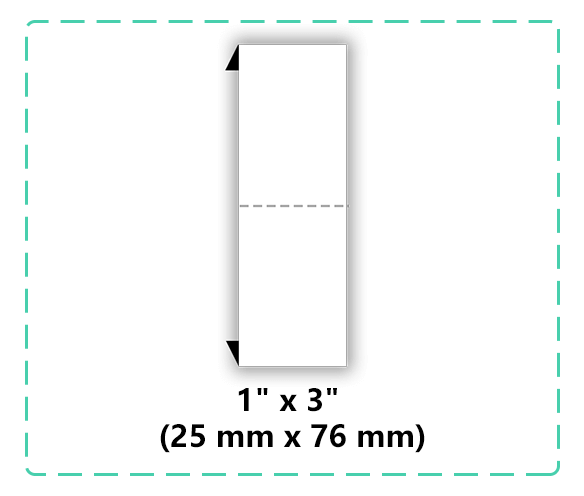
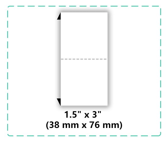
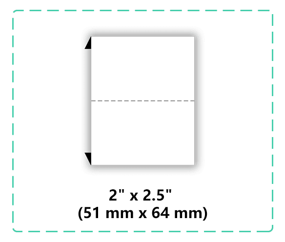
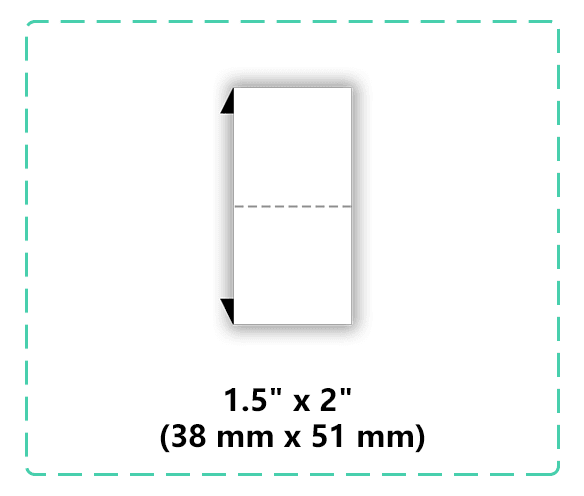
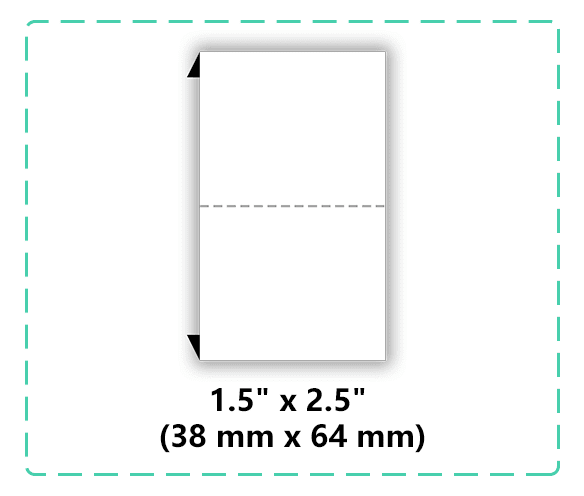
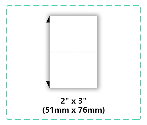
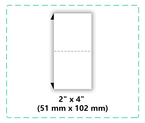
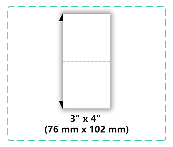
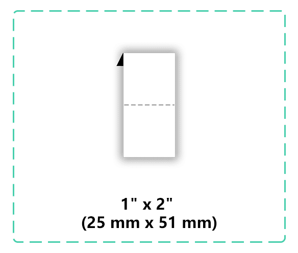
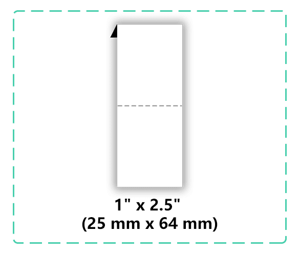
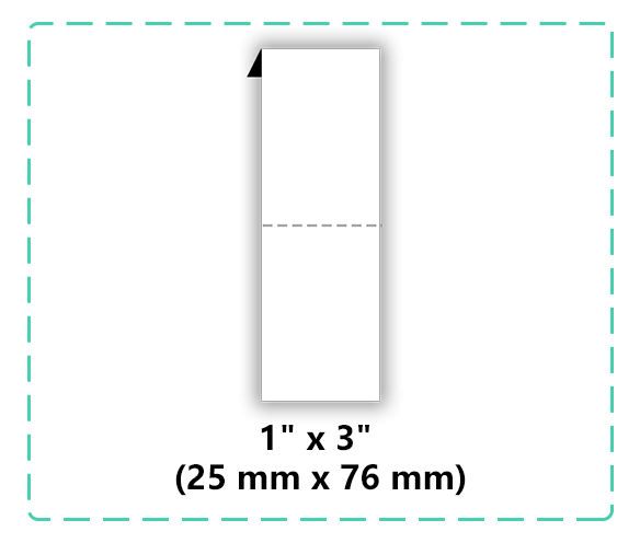
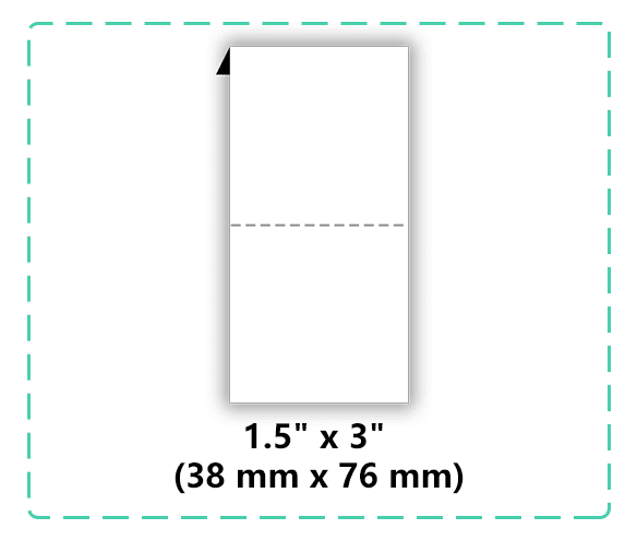
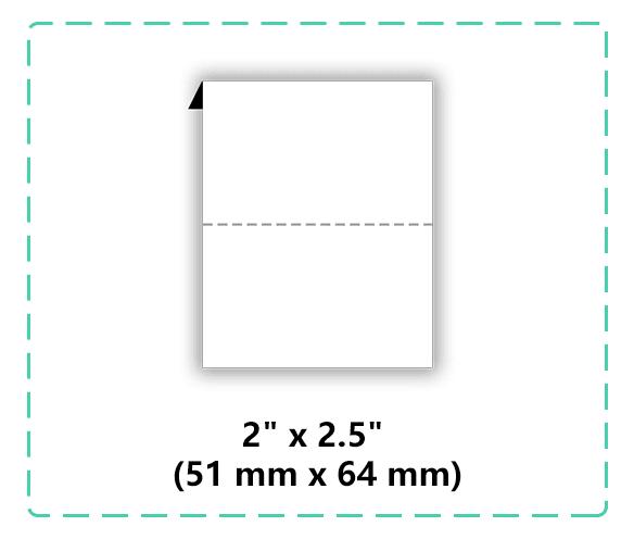
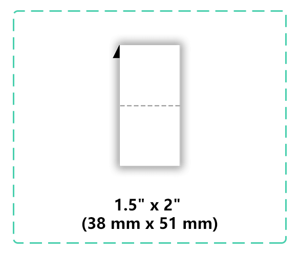
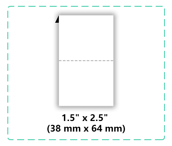
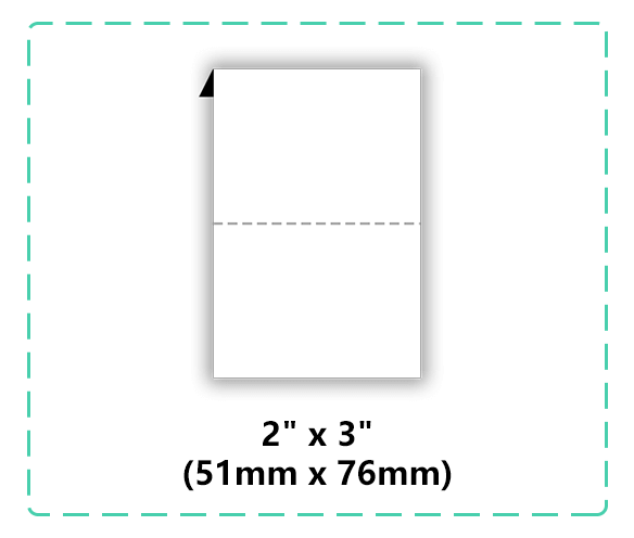
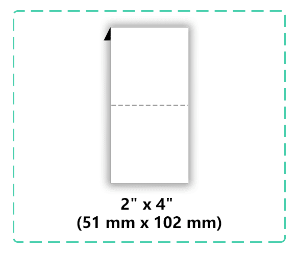
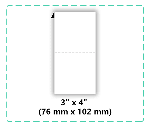
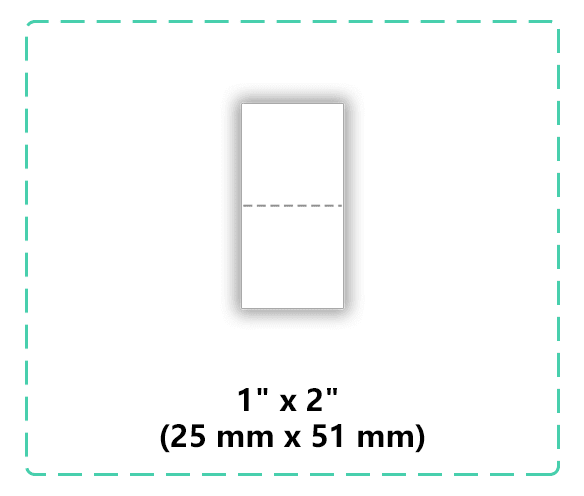
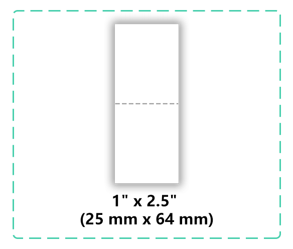
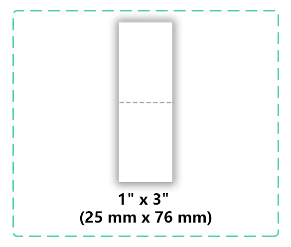
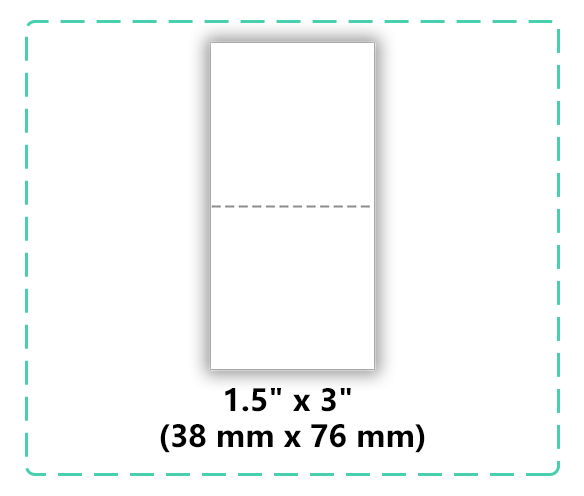
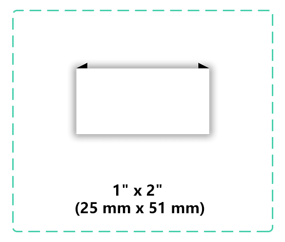
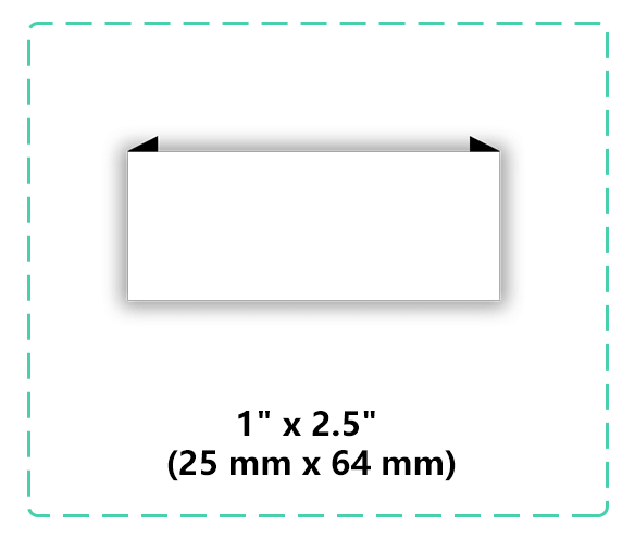
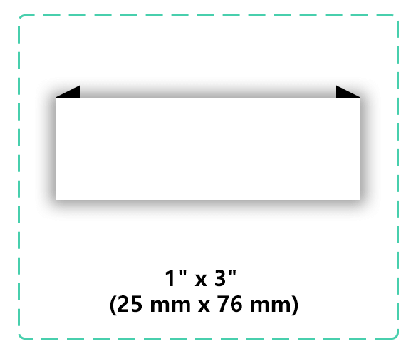
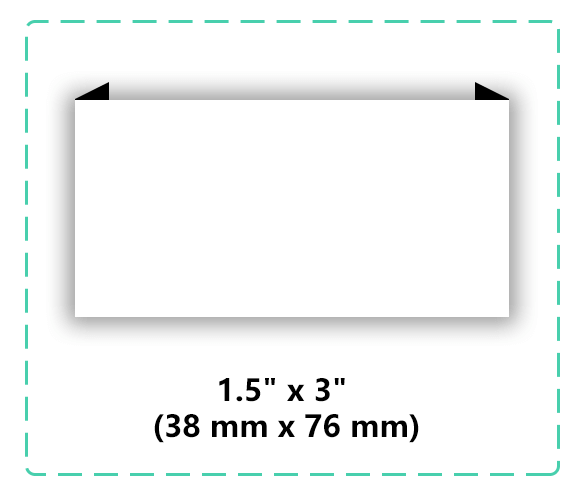
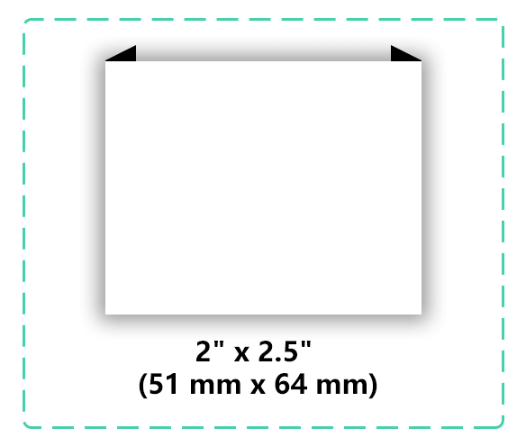
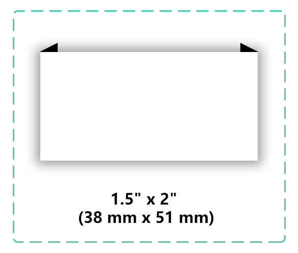
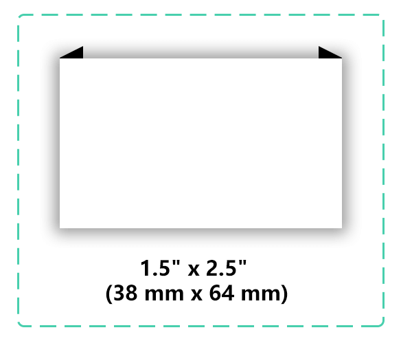
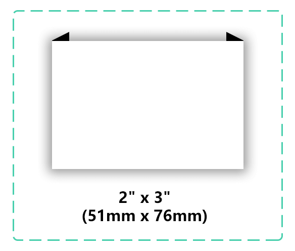
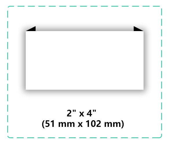
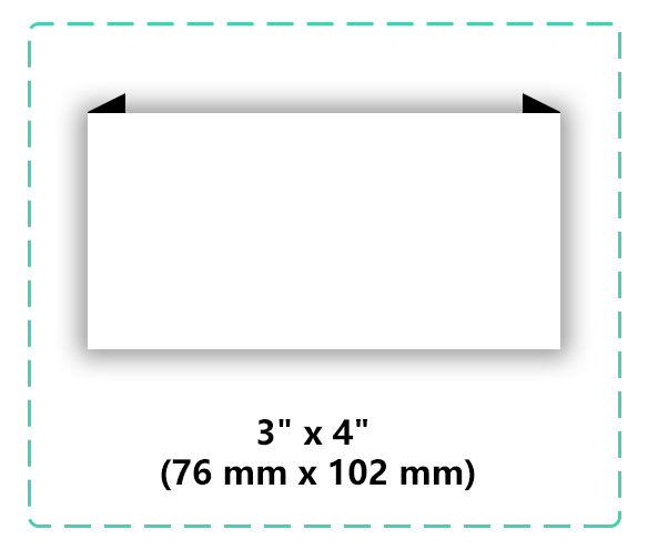
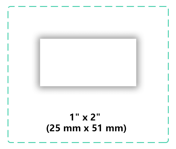
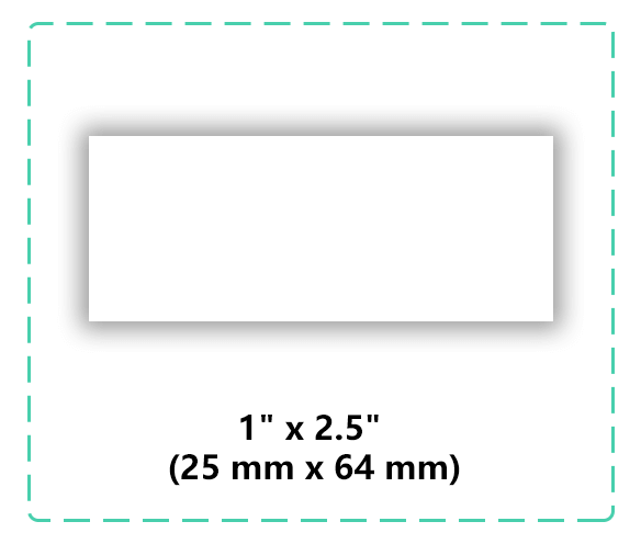
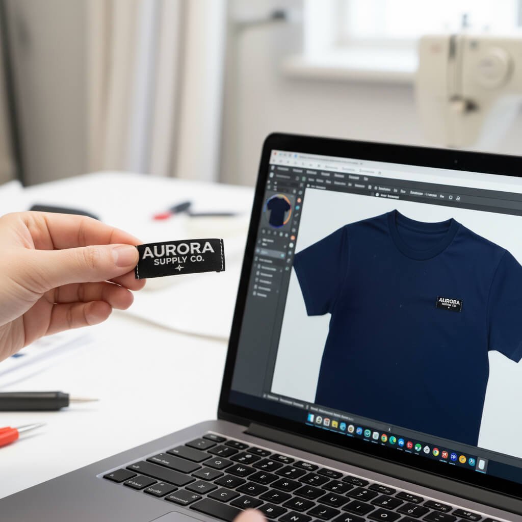
1️⃣ Mistake #1:Choosing the Wrong Size
One of the biggest mistakes? Making your label too big or too tiny.
A huge label can overpower your garment, while a small one can look cheap or unreadable.
👉 Pro tip: Before ordering, print your logo at the actual label size on paper and hold it against your product. You’ll instantly see if it fits right.
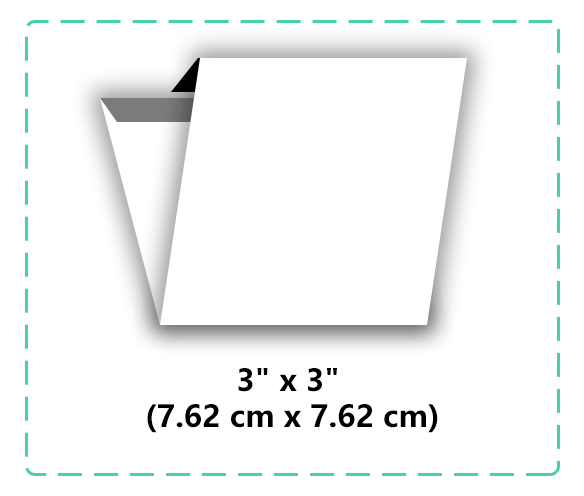
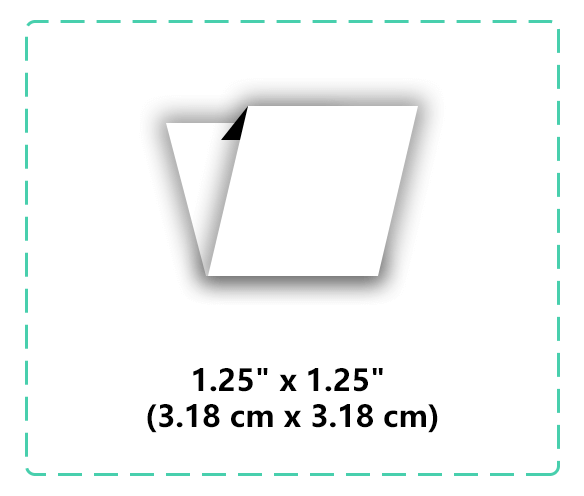
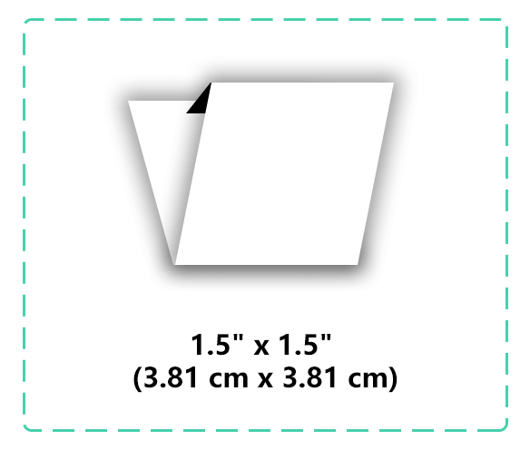
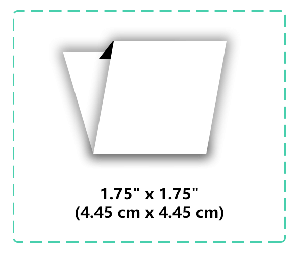
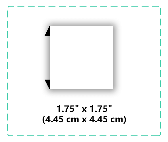
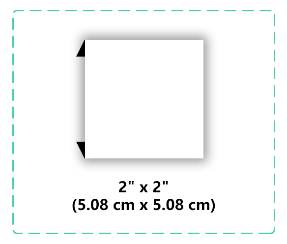
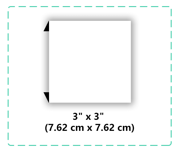
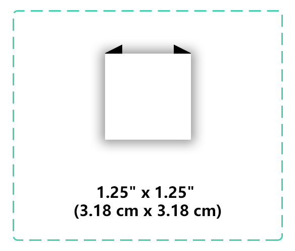
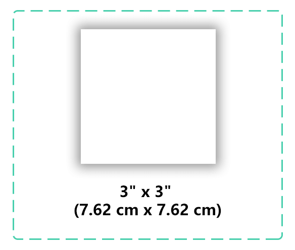
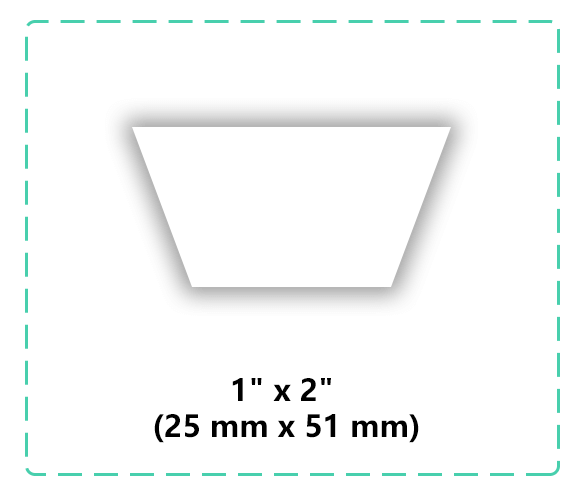
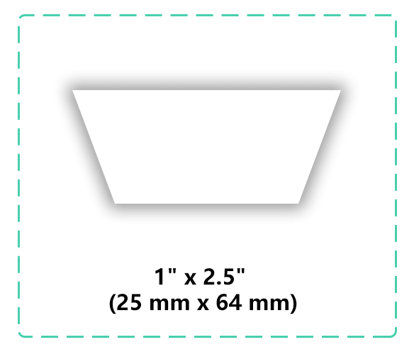
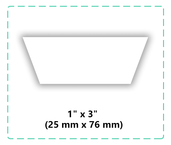
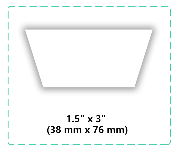
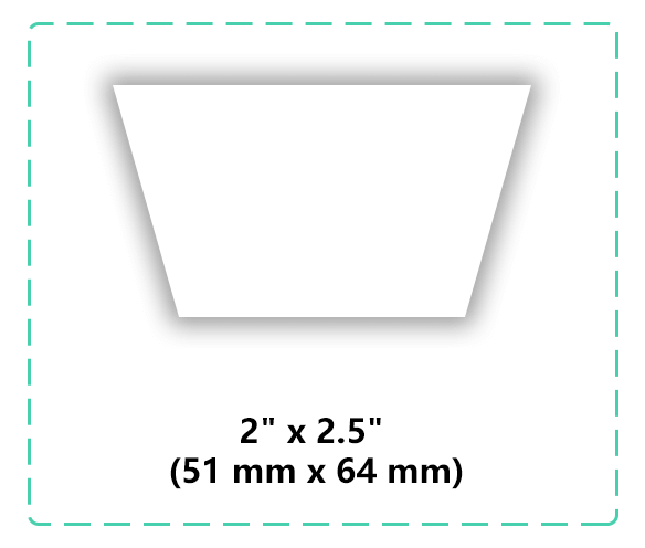
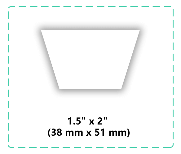
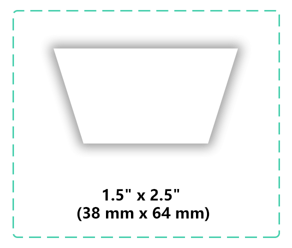
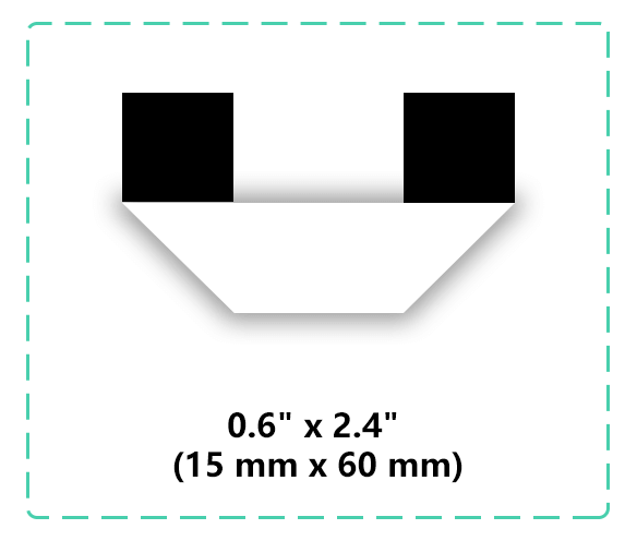
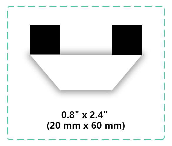
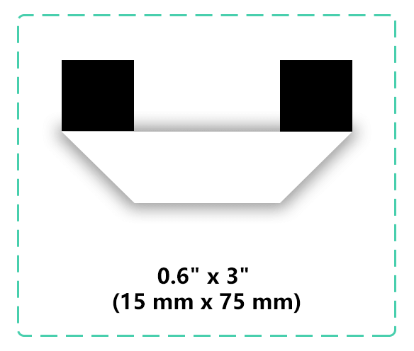
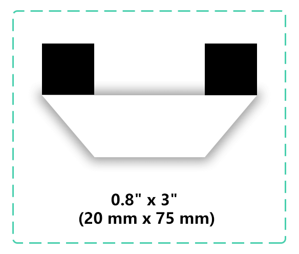
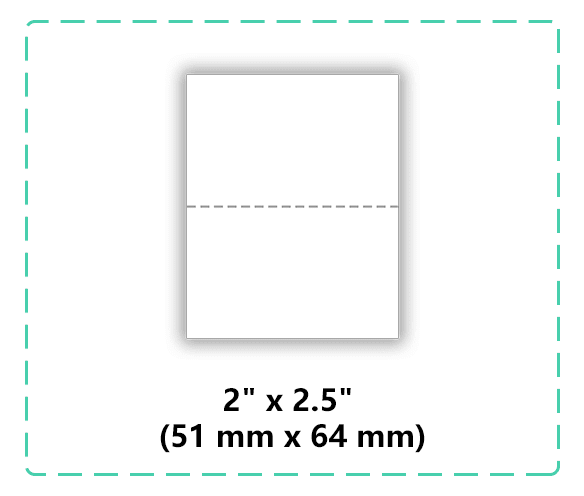
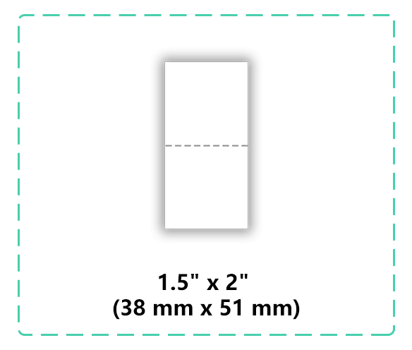
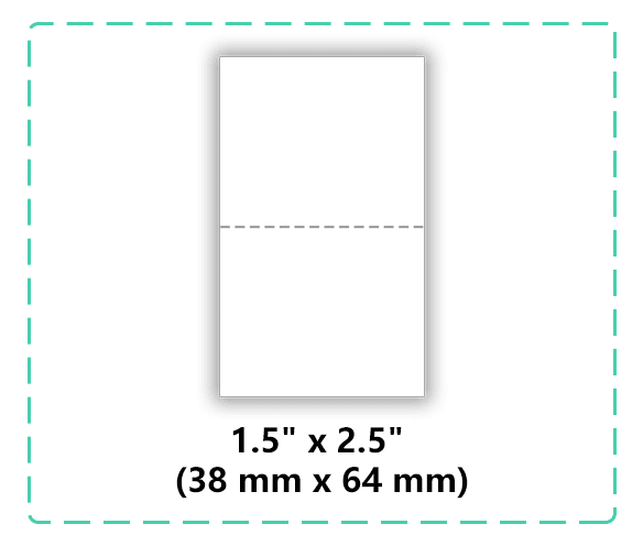
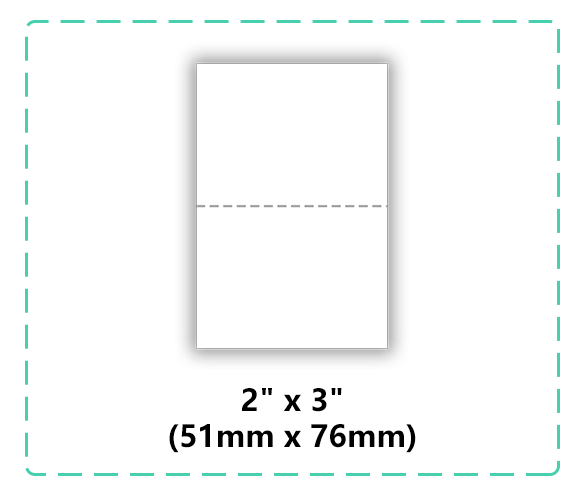
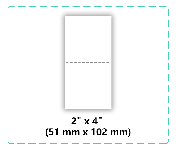
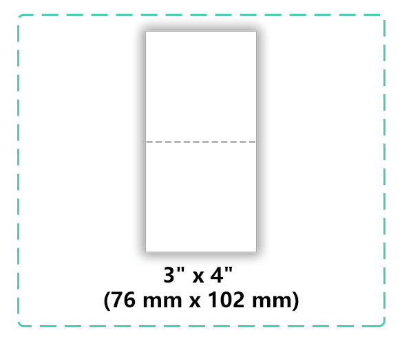
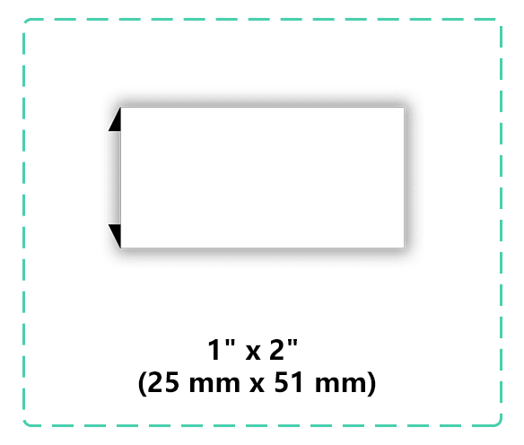
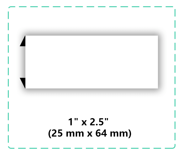
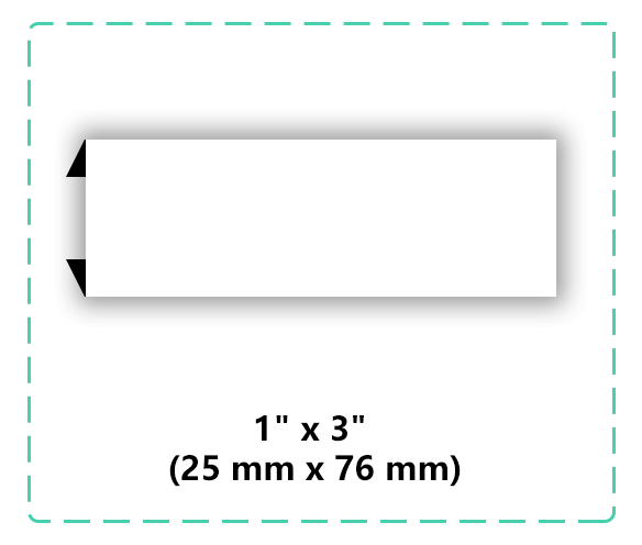
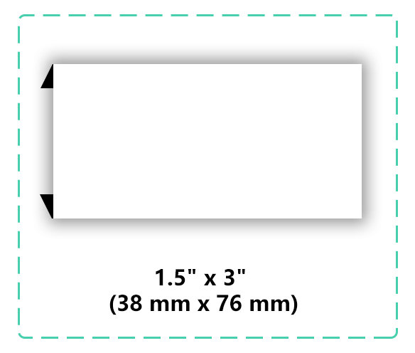
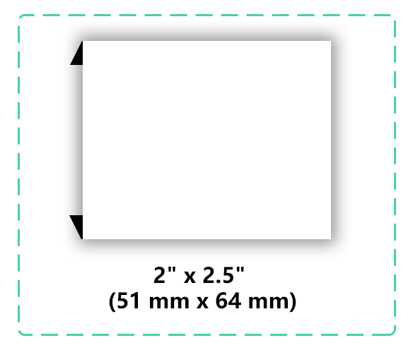
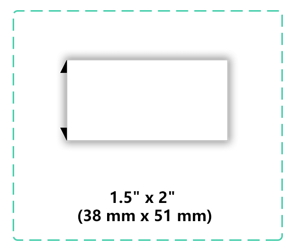
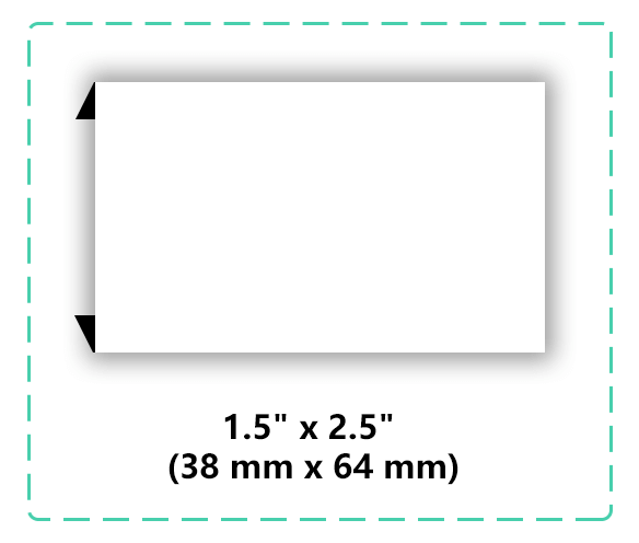
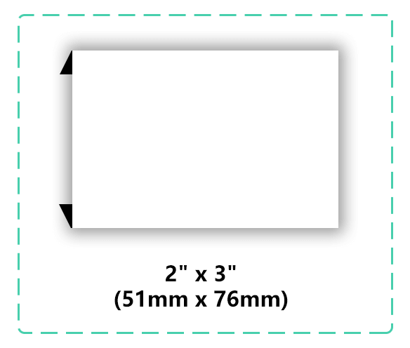
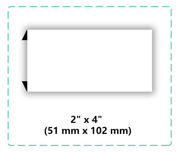
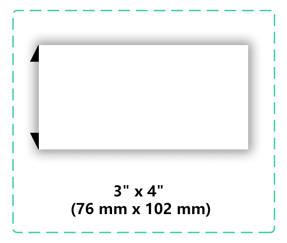
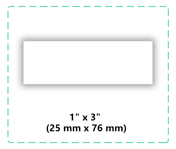
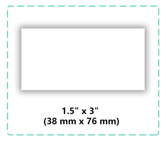
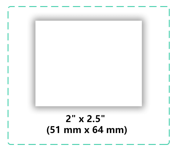
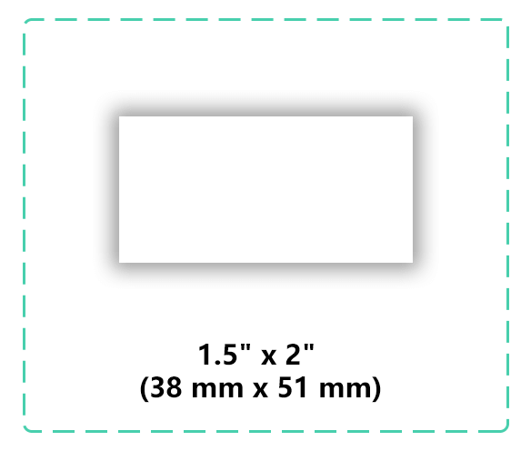
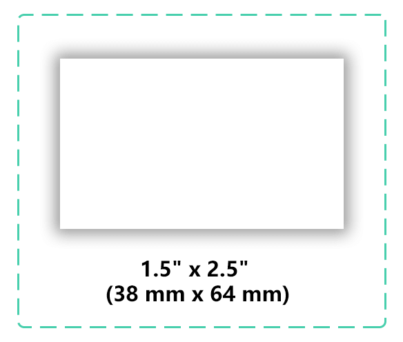
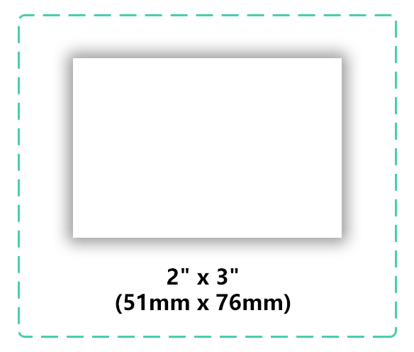
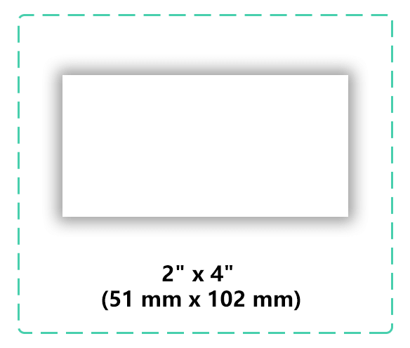
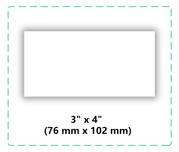
Not sure what size works best for your logo and placement? See our woven label size guide for a practical starting point.
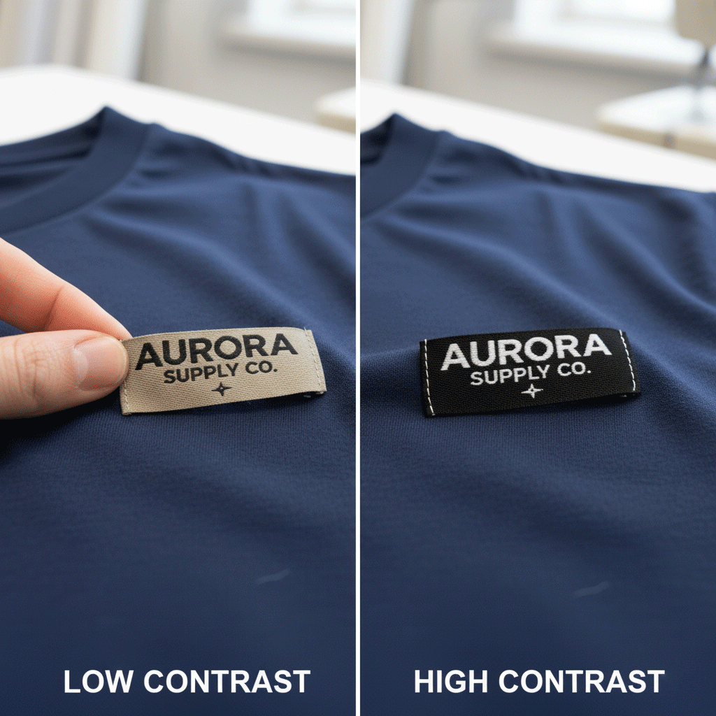
2️⃣ Mistake #2:Using Low-Contrast Colors
You might love soft tones, but if your text color blends into the background, your label becomes impossible to read.
High contrast always wins — think white on black, black on beige, or bright accents on neutral tones.
👉 Pro tip: Keep it simple. Your logo should be clear at a glance, even from a few feet away.
Before ordering, check our full range of Woven Labels
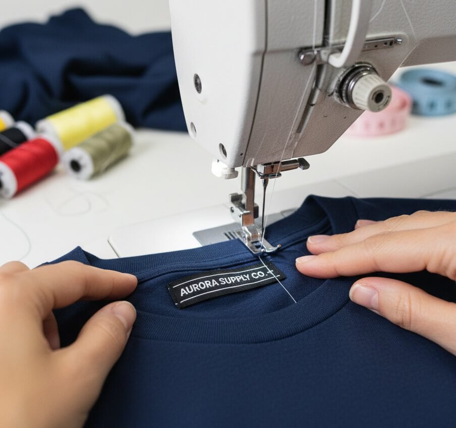
3️⃣ Mistake #3:Forgetting About Fold Type
Not all folds are created equal. A center fold label is great for necklines, while an end fold works best for hems and side seams.
Many new brands forget this step, ending up with labels that stick out or don’t sew neatly.
👉 Pro tip: Always decide where your label will go before choosing the fold type.
Check out our Woven Label Fold Guide for visuals and tips.
Need help matching fold type with your label style? Explore our custom woven labels page or request a free quote for practical guidance.
Avoid Costly Mistakes Early
Not Sure If Your Label Specs Are Heading in the Right Direction?
If you are still deciding on size, contrast, or fold type, we can help you review the basics before production. A clearer starting spec can save time, reduce revisions, and help your label look more professional.
- ✓ Help with size, fold, and finish selection
- ✓ Free digital proof before production
- ✓ Low MOQ available
4️⃣ Mistake #4:Ignoring Thread and Material Quality
Cheap labels fade, fray, and lose their shape fast.
If your brand prides itself on quality, your label should match that same standard.
👉 Pro tip: Choose damask woven labels for fine detail and softness — or satin woven labels for a more elegant touch.
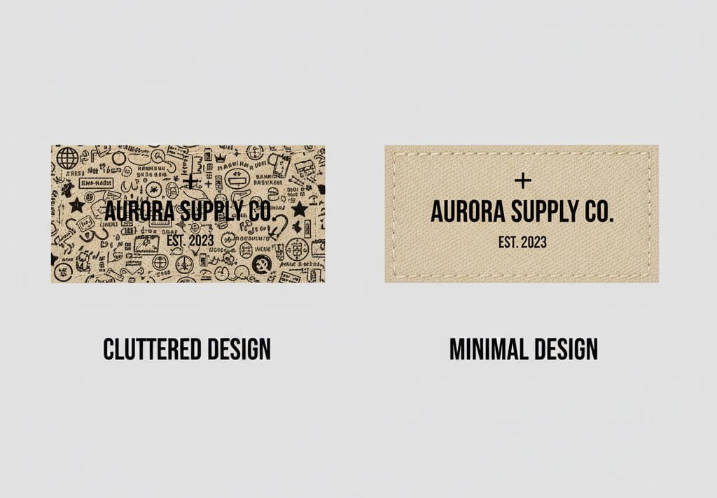
5️⃣ Mistake #5:Overcomplicating the Design
More doesn’t always mean better. Adding too many colors, tiny fonts, or complex icons often leads to blurry results in weaving.
👉 Pro tip: Keep your design clean and bold. Think about how it’ll look at 1 or 2 inches wide — not on a giant screen.
For softer branding, see Cotton Labels
6️⃣ Mistake #6:Not Reviewing a Sample
This one’s huge. Never skip the sample!
Your label can look perfect on screen but very different when woven. A sample helps you check color accuracy, texture, and text clarity before full production.
👉 Pro tip: At UpperLabels, we provide free design previews and quick samples, so you can confirm everything before production starts.
7️⃣ Mistake #7: Not Thinking About Sewing Placement
Even a perfect label can look bad if sewn in the wrong spot or at a crooked angle.
Placement matters more than you think — it affects the overall look of your product.
👉 Pro tip: Decide early whether your label goes on the neckline, hem, sleeve, or tag. Consistency builds brand recognition.
🌟 Bonus Tip: Make It Feel Like You
At the end of the day, your woven label should tell your story.
Whether you’re all about sustainability, bold streetwear, or minimalist luxury — your label is your silent spokesperson.
And with UpperLabels, it’s easier than ever to make that vision real —
✅ No minimums
✅ Free design help
✅ Fast sampling
Final Step
Want a Cleaner, Stronger, More Professional Woven Label?
If you already have your logo, text, or rough label idea, send it to us and we can help you avoid common mistakes before production starts.
A practical review before production can help improve readability, contrast, fold choice, and overall finish — especially when you want your label to feel more premium in the final product.
- ✓ Share your logo, text, or artwork
- ✓ Tell us how and where the label will be used
- ✓ We’ll help you confirm a more practical woven label direction